


Unless you have turned off all electronic devices in recent days, you have noticed that bitcoin makes new highs almost every day. An outbreak which is mainly explained by the capital flowing massively into Bitcoin Spot ETFs on the other side of the Atlantic. With this in mind, let's navigate the sprawling Bitcoin network to observe the trends of speculators and investors.
Graph: Bitcoin makes you dizzy
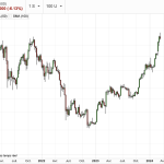
Because numbers sometimes speak louder than words, here are some of the performances of bitcoin in recent times:
- Between January 1, 2023 and December 31, 2023: +156%
- Between January 1, 2023 and today (March 15, 2024): +305%
- Between January 1, 2024 and today : +58%
- Since the launch of Bitcoin Spot ETFs (January 11, 2024): +44%
- Since March 1 (current month): +8.6%

BTC/USD
Zonebourse
Now, let's dive into the bitcoin network via on-chain analysis, that is, by examining transactions directly on the Bitcoin blockchain.
The volumes regain color
Comparing the magnitude and trend of bitcoin transfer volumes on the network on a monthly and annual basis can be informative.
The chart above compares the monthly average (red curve) of the transfer volume at the annual average (blue curve) which allows one to appreciate relative changes in dominant sentiment on the network, and also help identify when trends pivot regarding the activity of market participants. Let's take a look at the graph, and then we'll comment on it next.

Bitcoin volumes
Glassnode
To put it simply, if the monthly red curve is greater than the annual blue curvethen this indicates an expansion of activity on the blockchain, which is typical of the improvement in the fundamentals of the network, and an increasing use of it.
Conversely, if the monthly red curve is less than the annual blue curvethen this indicates a contraction of activity on the chain, typical of a deterioration in the attractiveness of the network, and a decline in the use of network actors.
It is clear that since November 8, 2023 – the date on which the monthly curve crossed the annual curve – activity on the bitcoin network has clearly picked up.
This is mainly explained by an anticipation of network participants on the imminent approval of Bitcoin Spot ETFs in the United States. At the end of 2023, it was almost certain that the American regulator would accept these stock market products so that investors could gain direct exposure to bitcoin. Naturally, many have positioned themselves ahead of official approval, anticipating capital flows into ETFs. A winning bet for those who acted in this way.
Speculators VS Investors: RHODL Ratio
The RHODL Ratio is an oscillator that allows, in a certain way, to compare the wealth in dollars held by new arrivals (over a week) compared to the oldest investors (between one and two years). Let's take a look at the chart and then we break down the RHODL Ratio.

Increase in speculation : An upward trend in the RHODL ratio (red arrow above) suggests an increase in USD wealth held by new bitcoin buyers (over a week). A typical movement of the bull market resumption and speculation peaks.
Rise in dominance of old bitcoins: A downward trend in the RHODL ratio (green arrow) indicates a dominance of USD wealth held by actors holding “old” bitcoins that were acquired between 1 and 2 years ago. This drop in RHODL suggests a trend of accumulation and conservation of bitcoins in the medium to long term. In other words, BTCs become older on average (compared to their date of purchase).
Once again, new money is reflected in the RHODL Ratio. The speculation is there. But for how long ?
To corroborate the previous graph, we can isolate the bitcoins stored in each age group component (1 week VS 1 year-2 years), which allows us to visualize this transfer of wealth during the cycle.
- At the bottom of bear markets, the investor cohort holds a dominant proportion of the wealth, with the blue curve (in the chart below) 1 year-2 years reaching its cycle peak.
- At the peak of bull markets, the speculator cohort now dominates supply, with the 1-week squash curve (in the chart below) peaking, as prices reach their cyclical peak.
Once again, a market breakout to new ATHs corresponds to a shift in dominance, where the capital held by new speculators exceeds that held by longer-term investors.

RHODL Ratio
Glassnode
The speculators
On the following graph, we observe that overall short-term holders of bitcoins, that is to say the share of BTCs which have been moved (purchase, sale or transfer) between 1 day and 3 months, are recovering.
While this category of bitcoins in circulation represented only 12% of all bitcoins in circulation in November 2022, that is to say when Sam Bankman-Fried's FTX collapsed, it now represents almost 40% bitcoins in circulation. This signals the enthusiasm of network players, particularly with a strong return of speculators with the surge in bitcoin.

Realized Cap HODL Waves
Glassnode
Investors
The trend is clearly reversed for long-term holders. The following graph displays the share (in percentage) of BTC acquired between 1 year and 7 years. The “old” BTC in circulation on the network has, as usual, a clear tendency to decrease when bitcoin reaches new heights.

Realized Cap HODL Waves
Glassnode
During dark periods in the bitcoin price, long-term holders accumulate supply. While during periods of euphoria, old hands distribute their expensive coins into the hands of speculating bulls (thus turning the trend in favor of bears, selling cheap coins at a loss). A completely reversed behavior compared to young hands as we could see in the previous graphs.
By studying the behavioral cycles of crypto-investors, we can develop hypotheses regarding the balance of supply and demand. We can see that the modus operandi of “smart money” is similar over time: accumulating cheap supply in the phases of “bear market” to realize profits months/years later in the euphoria phases of “bull market”.
You are probably saying to yourself that it is enough to simply follow the movements of the old hands by replicating their operations. But the demons of greed and FOMO shake investors when markets take off. Managing emotions in a market as volatile as digital assets turns out to be a real duel with yourself. Managing your emotions in order to take your place alongside smart money and knowing how to get out before it is too late turns out to be a real obstacle course.
Profit taking on bitcoin
Profit taking is exploding to levels similar to January 2021, when bitcoin was also on the rise. Peak profit taking reached $3.6 billion over 24 hours. On the other hand, at the time, we had to wait 10 months after this peak of profit taking to see BTC reach its peak of $68,900 before it fell to its absolute low around $15,500 a year later. late.

Profit taking
Glassnode
Flows into Bitcoins Spot ETFs
These are thehe Bitcoin Spot ETFs which have mainly fueled the rise in bitcoin since the start of the year, notably with a record day of net inflows into these stock products on Wednesday. No less than $1.05 billion flowed into ETFs in a single day. More generally, all ten Bitcoin ETFs display $57.86 billion in assets under management, which represents 4.16% of all bitcoins in circulation. BlackRock's Bitcoin ETF (IBIT), which displays the largest volumes, now holds almost $16 billion in assets under management.

Capital Flows into Bitcoin Spot ETFs
SoSo Value


+ There are no comments
Add yours